We have literally gone through hundreds of websites for you.to. We’ve put together some of the best web design tips. So enjoy.
1. MAKE SURE YOU PLAN AHEAD
Contractors and builders work off plans, so homes don’t end up looking weird or not flowing.
Make a sure plan for your website, your “blueprints,” and the organization of your site will follow. What is the purpose of your site? To fill out a form? Purchase a product? Contact you? Just inform people? You must define the goal of the website, instead of adding in a confusing, jargon that doesn’t fit.
You’d be surprised at how much wasted content we found within pages of the sites we looked at. Not only should the entire website have a purpose, but each individual page on the site should also have it’s own purpose. For many users, the page they land on might be the only page they read on your site.
Visitor to your site need to be able to be able to discern what your site is about regardless of which page they land on.
2. SIMPLIFY THINGS
Sometimes less is more.
Sometimes design elements on a website can overwhelm site visitors enough to make them give up bounce. Internet users have no patience in today’s I want it now world. Make it easy through a very simple web design.
The best websites keep their color schemes to around three colors. I understand that some websites will have more than three, but keep the look of your site similar by minimizing and being consistent the types of colors you use.
3. DISPLAY YOUR CONTACT INFORMATION PROMINENTLY
Many websites we looked at seem to shy away from wanting people to contact them. But if you are a business, this is a deadly sin as people want to be able to contact you with questions before and after the sale. It may look shady or untrustworthy if your contact information is not displayed in an easy to see manner.
Make all your contact information prominent and visible. I would recommend placing those details in the header and footer of your site. If your clients have questions or concerns, or if they want additional information, make you make it easy for them to do.
People have told me that they don’t feel they need contact information in the header because they have a Contact page. While that is great, what if the only page your visitor sees is not the Contact Us page? Most website visitors only view one page of your site.
Stop running away from your clients!
4. WHAT LOCATION(S) DO YOU SERVE
Are you a local or national company? This is an easy question, but your service areas should be easily seen on your website.
If you service a national area and sell a product, is the cart readily accessible? Which locations do you deliver to? Do you have an easy to navigate product or services list?
If you have a local website, a visitor should be able to see the area that you serve. Where are you located? Do you have a local or toll free phone number? Some things to think about.
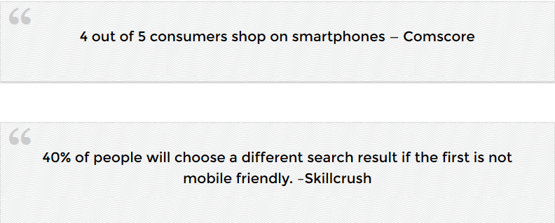
5. MAKE YOUR SITE MOBILE FRIENDLY
A responsive mobile friendly website changes the size of the website and viewing area depending on the device. Different phones, tablets, and desktops all have various screen sizes. A responsive or mobile friendly website creates the optimal viewer experience on smart phones.
If the two stats above do not convince you to get a responsive website, I have more statistics from PewResearchCenter:
- 63% of people in the US and UK access the Internet mainly though mobile devices.
- 46% of smartphone owners say their smartphones are something “they couldn’t live without.”
- Nearly two-thirds of adults in the United States own a smartphone.
- 36% of smartphone users go online using mostly their phones, and not on a desktop, laptop, or other device.
- 46% of people using mobile devices report problems while viewing a static site. A static site is a traditional, non-responsive website.
- 44% of people surveyed claim that websites were difficult to navigate on smaller devices.
Smartphone usage is only increasing. Make sure you design a mobile-friendly and responsive website.
6. BE OBVIOUS
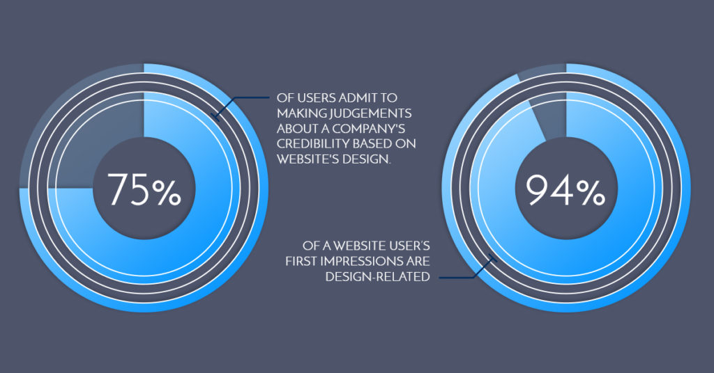
You have 4 seconds for users to form an opinion about your business when they view your website. So your site has to be very clear in its objective. The design of a website is the very first thing in determining whether a user will stay on your site or click off it.
A user should be able to land on your page for a split second and know what your page is about. Are you a plumber? What area do you serve? Can they purchase a product? Will there be someone live to chat with on the site?
Potential customers make initial impressions immediately when they open a website, including whether they think the website is trustworthy or not. How is a user going to trust you if they do not trust your site?
Go through your website. Look at the different pages very quickly and objectively and see if you understand the message of each individual page. Ask a good friend to do the same, and then get their feed back.
7. INCLUDE MANY CALLS TO ACTION
What do you want the user to do? Call you for a free consultation? Sign up for a newsletter? Purchase a product? Use your service? Give you their email?
Having strong multiple calls to action is the best way to get your page viewer to take an action.
People need to be lead to make decisions. Small micro decisions that lead to your desired action.
Although though a call to action is important, 73% of websites don’t have one. Imagine, 73% of all websites cross their fingers hoping the user stumbles upon their product or service.
I won’t dive into what color or font to use on your calls to action. My point for this is to have many calls to action. Make them very visible and noticeable. Over time, test out your calls to action and see which ones convert better.
You want your website to work for you, make sure you have calls to action. It’s a must.
8. LET VISITORS KNOW WHO YOU ARE
Big-name companies spend millions on branding each year. Not a single small business I know of has that kind of spending power.
However, there is a secret I know and will share with here.
Create an (About Us Page)
“About Us” pages are underutilized for some reason but important for your website. Make sure you differentiate yourself from your competition by putting a face and name to your business. One case study showed a 104.5% increase in sign-ups after including a picture of a customer or owner on the site.
The “About Us” page is where you can build trust and help visitors get a better idea of who you are. As easy as it sounds, having an “About Us” page could be the difference between someone calling you, or going down the street to spend their money..
So don’t under estimate the power of the About US page.
9. USE A READABLE FONT AND TEXT SIZE
Have you ever watched a TV commercial where, at the end of the commercial, maybe for as long as 10 seconds, someone talks really fast to go over the terms and conditions? I’ll call this the “fine print.”
A drug commercial might list the possible side effects or diseases you may contract. I think I have even heard some of these commercials list death as a possible side effect. Doesn’t that “fine print” at the end of commercials make you a little nervous because you aren’t 100% sure what is happening? You may feel like you have to sign your life away as a requirement for the product.
Avoid fine print as the main print on your website. I have seen great content on websites lose its value because it was published with minuscule print. If your customer wants to read all the text on your page, let them read it easily with a legible font size. You can test your website’s text is large enough through Google’s Mobile-Friendly Test.
Have you ever had to fill out a CAPTCHA code to prove you were human? (Fun fact: CAPTCHA stands for “Completely Automated Public Turing test to tell Computers and Humans Apart.”) It’s super frustrating and hard to read, and sometimes you just give up and go to the next code.
Don’t put your readers through the CAPTCHA code treatment by using unreadable and crazy fonts. Let your fonts reflect your business, but also make them easy to read. Don’t put your customers through the “fine print” and “CAPTCHA code” experience!
10. INCREASE PAGE LOAD SPEED
I would like to reiterate how lazy people get when they are online. A slow website is the equivalent of making someone wait 30 minutes at a restaurant when they aren’t even sure what’s on the menu.
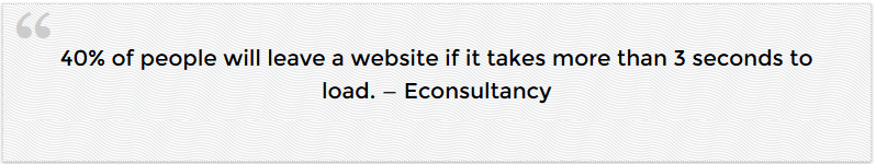
No matter how awesome and well-designed your website is, it won’t matter if people never make it to your website because it loads too slowly. Use this website speed test tool for ideas on how to improve the load times of your website.
Wow, those were really good tips, but what you really want to know is what to do with all this information. It’s the moment you have all been waiting for. My suggestion is for you to implement the tips I talked about.
If you skipped straight to the end of this article or skimmed through the headings, go back and read about ex-boyfriends or ex-girlfriends, NASA, and the people that talk really quickly at the end of commercials. All of the tips I’ve presented are necessary for a properly fine-tuned, fully functional website, and I strongly suggest you implement them.